
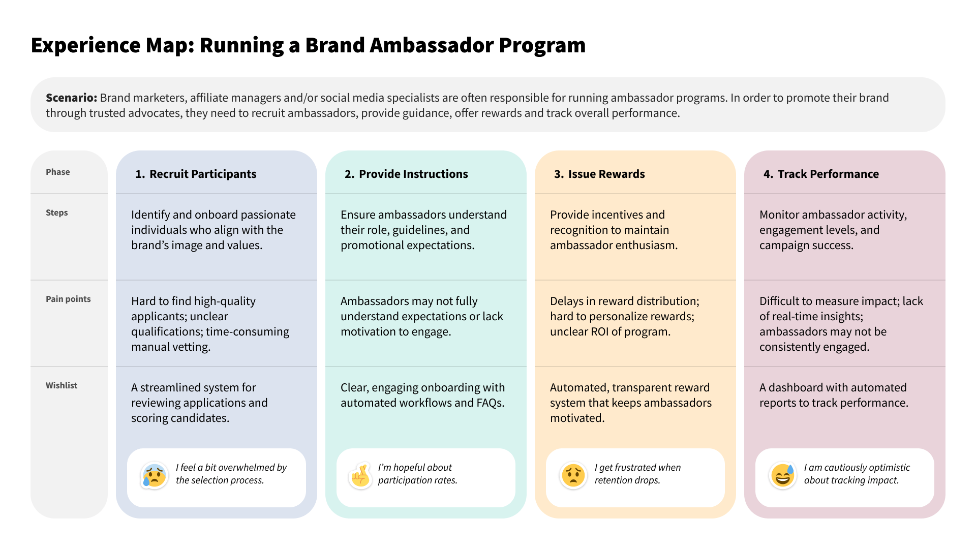
Brand marketers were cobbling together spreadsheets, forms, and DMs to manage ambassador programs. Our goal was to fix that.
TL;DR
- Role & Scope — Lead UX designer for a six-month, multi-phase build of the Community Manager feature, spanning research, strategy, design, prototyping, and implementation support.
- User Problem — Marketers were running ambassador programs with fragmented tools leading to inefficiency, lack of visibility, and fragile workflows.
- Business Goals — Increase platform adoption, improve client retention, and expand self-service capabilities to boost contract value.
- Impact — Positive user feedback, reduced management time for marketers, and cross-platform adoption of key UI components.
Setting the Foundation
I served as lead UX designer on a small cross-functional team dedicated to building a new feature: the Community Manager. My responsibilities covered everything from early research and product strategy to detailed wireframes, prototypes, and final implementation support. This was a six-month, multi-phase initiative, and I worked closely with PMs, engineers, and other designers to bring it to life.
From a business standpoint, this project supported three major goals:
- Increase platform adoption
- Improve client retention by solving real pain points
- Expand the platform’s self-service capabilities to drive contract value.
On a day-to-day level, we were designing for real marketers trying to do real work—often with limited time and too many tools. Our mission was clear—give marketers better control over how they run ambassador programs, while removing the manual effort and fragmented tools they were using to make it work.
Understanding the Problem
We started with interviews—both with internal teams and with clients running mature ambassador programs. What we found was a wide range of improvisation: some used Google Sheets to track members, others used email and Typeform to handle applications, and nearly everyone mentioned a lack of visibility into performance. It wasn’t just inefficient—it was fragile.
To better understand the opportunity, we audited leading platforms in the community and contact management space, ran journey-mapping workshops, and conducted usability tests on early concepts. Three core needs emerged again and again:
- A better way to manage applications
- A simpler way to communicate at scale
- Visibility into program outcomes.
We shaped our strategy around four core capabilities: a centralized directory for participant management, a trackable application workflow, lightweight communication tools, and basic reporting for engagement and performance.
Designing in Phases
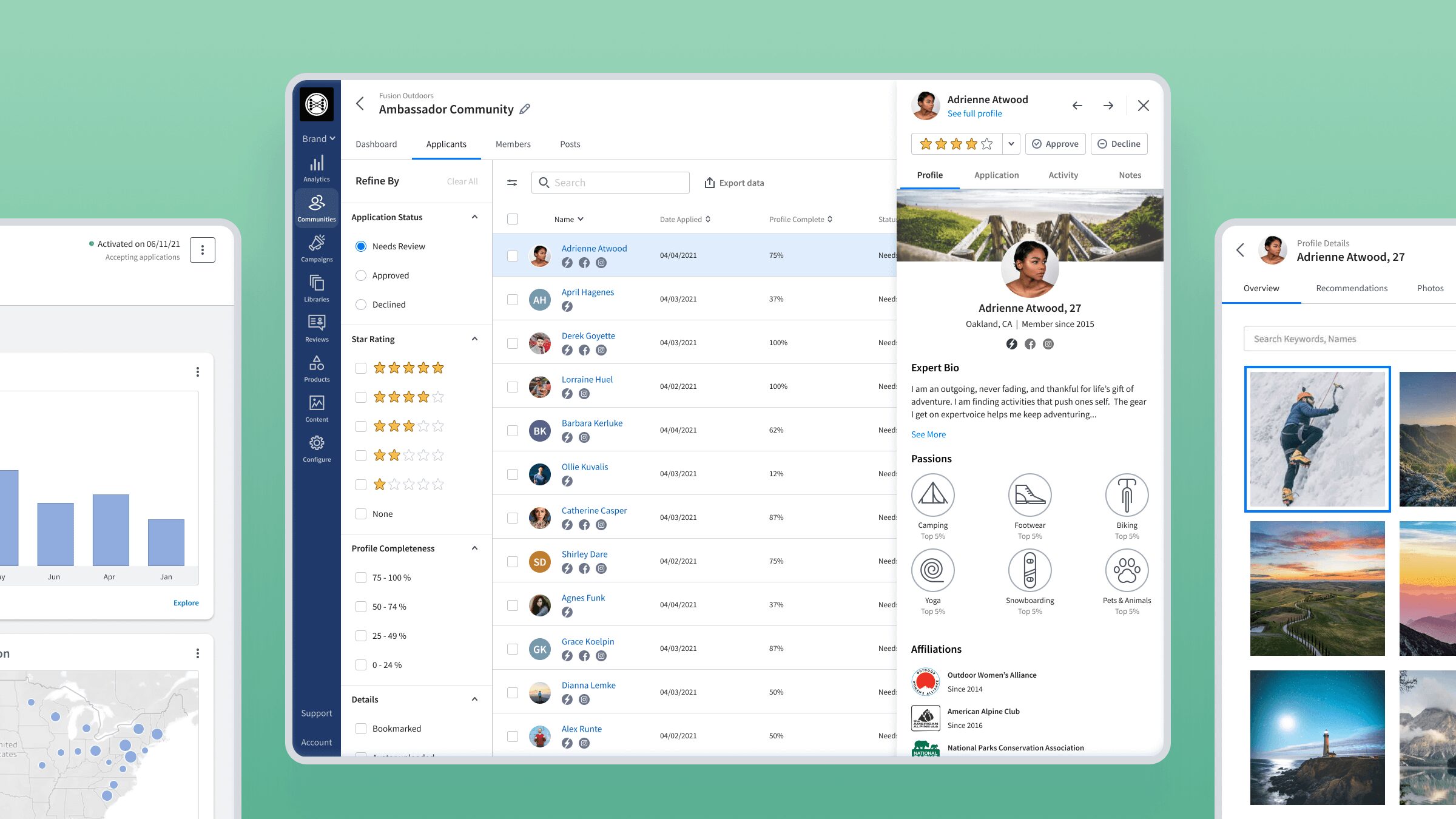
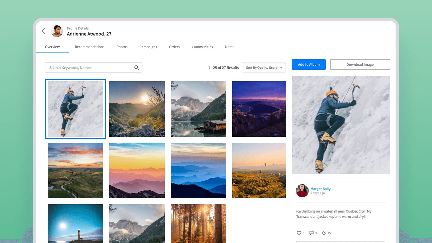
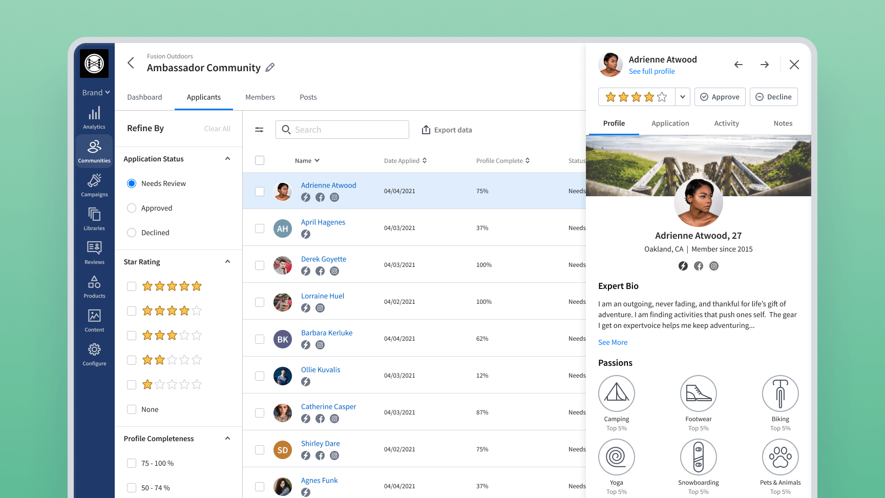
To reduce risk and allow for feedback loops, we delivered the product in three iterative phases. We began with the core: a searchable community directory and individual member profiles. This phase established navigation patterns and set the tone for how marketers would interact with ambassador data. I designed scalable table components that supported sorting, filtering, and batch actions.
Next, we introduced the application review flow. We added features like application status, reviewer notes, and simple scoring to help marketers prioritize candidates. I tested the prototype with several early users—including Leslie—and refined both the interaction design and the language based on their feedback. Seeing her excitement grow as the tool took shape was a highlight of the process.
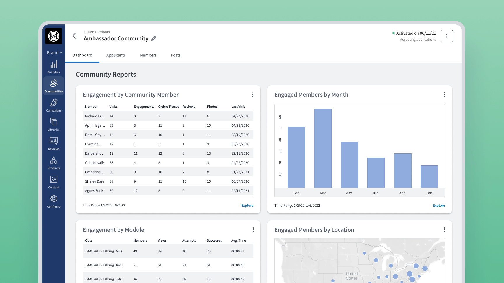
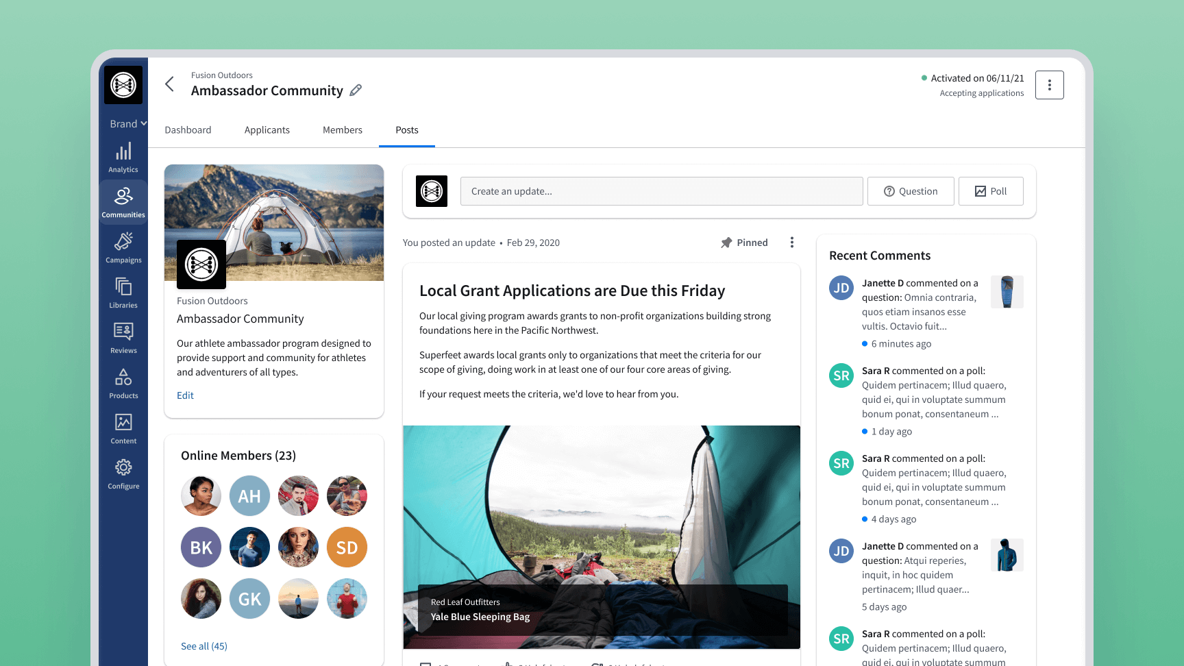
In our final phase, we shipped communication and reporting features. This included the ability to post updates to the entire community, send system notifications, and view basic reporting dashboards tied to participation and content output. What surprised us was just how valued these features became—marketers were thrilled to finally be able to reach their ambassadors directly, without resorting to third-party email platforms.
Design Principles
Throughout the process, I leaned on design principles that emphasized clarity and consistency. We focused on reducing cognitive load by simplifying interactions and highlighting the most important actions. I intentionally designed the UI to feel familiar—drawing from widely-used patterns in CRM and marketing platforms—while ensuring it remained consistent with our existing design system. These decisions helped the new tools feel like a natural extension of the platform rather than a bolt-on.
Impact and Results
After launch, Community Manager received overwhelmingly positive feedback. Marketers found the tools intuitive, and client teams reported a noticeable drop in the time it took to manage their ambassador programs. Perhaps most telling, several UI components we built for this project—like the scalable table and the status-filter system—were quickly adopted across other parts of the product.
The most rewarding part was seeing the huge flood of content and reviews from members—especially from those who went above and beyond.
— Drake A., Sales Manager
Reflections
If I could go back, I would push harder to clarify the distinctions between different campaign types—ambassador, product sampling, and influencer—within the UI. These tracks were sometimes confusing for users, but timeline constraints meant we had to deprioritize that clarification. I also think we could have benefited from deeper external usability testing earlier in the process. While internal feedback was strong, client testing might have helped us sharpen key decisions pre-launch.
One of the unexpected wins was just how valuable the communication tools turned out to be. They weren’t the initial focus of the build, but they quickly became essential to our users. Next time, I’d prioritize that functionality sooner.