
Introducing a versatile tool for onsite merchandising helped transform a low-engagement space into a high-performing asset.
TL;DR
- Role & Scope — Led UX design for both consumer-facing hero banners and internal campaign management tools as part of a Q3 2023 merchandising initiative.
- Business Goals — Increase engagement and revenue, balance marketing revenue with e-commerce performance and Streamline campaign operations
- Design Approach — Redesigned admin tools for faster, more flexible campaign setup with cross-device previews, SVG support, and improved scheduling visibility.
- Impact — Increased clicks and order volume, reduced QA time, and laid groundwork for future merchandising capabilities.
The Challenge
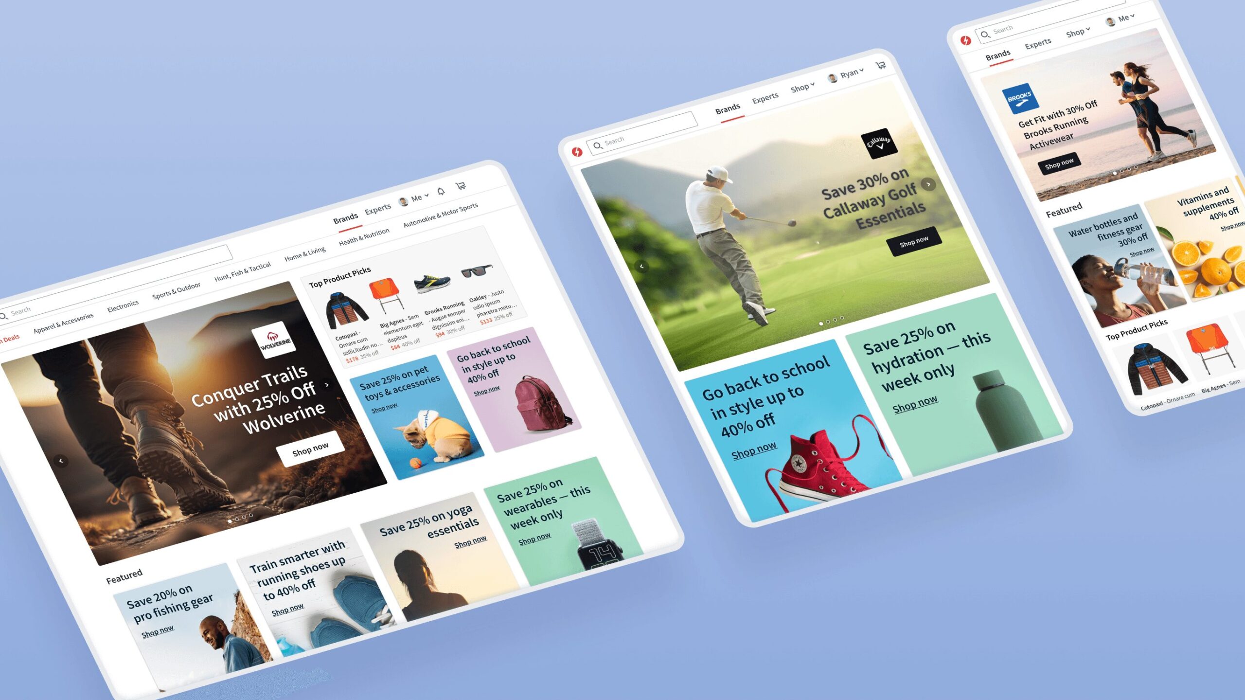
ExpertVoice’s home page featured a prominent hero banner carousel that occupied more than 50% of the above-the-fold space on desktop and mobile. While this space was highly visible and sold to partner brands as ad placements, it wasn’t driving meaningful engagement—users scrolled through slides but clicked far more often on products and links below the carousel.
From a business perspective, focusing on conversions and order volume was likely more profitable than selling ad space, yet marketing’s revenue from hero placements made this a delicate balance.
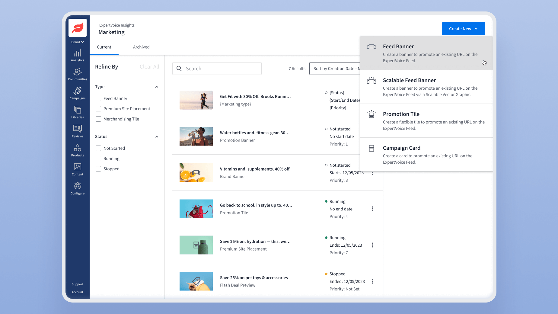
On the operations side, campaign management was tedious and inefficient. The process required context-switching between Jira tickets, Google Sheets, and two outdated admin tools, resulting in slow campaign launches and limited merchandising flexibility.
The challenge was twofold:
- Design a consumer experience that better leveraged above-the-fold real estate to drive engagement and revenue.
- Redesign the internal tools to simplify campaign creation and give marketing teams more creative flexibility.
My Role
I was the lead product designer, responsible for both the consumer experience and the internal platform tools, working from conception to launch.
This project ran throughout Q3 2023 as part of a broader company initiative to improve e-commerce merchandising. I collaborated with a PM, back-end and front-end dev leads, a QA lead, and stakeholders from Marketing and Commerce.
Research & Insights
Consumer Experience
To understand how users interacted with the existing carousel, I combined quantitative and qualitative methods:
- Google Analytics & Behavure.ai for engagement and conversion data.
- Hotjar heatmaps & session recordings to visualize scrolling and click behavior.
- Competitive analysis guided by Baymard Institute’s e-commerce UX benchmarks.
- Usability testing via Lyssna to evaluate different design directions.
Key insight: Users scrolled through slides but rarely clicked hero banners, confirming that valuable above-the-fold space could be used more effectively.
Hotjar data showed low click activity on the carousel compared to products and links immediately below
Internal Platform Tools
I shadowed campaign setup sessions, conducted stakeholder interviews, and ran moderated usability studies with internal users.
Key insights:
- Mobile-specific assets were rarely created—a major gap, given mobile traffic volume.
- QA was tedious and error-prone, often due to poor preview tools.
- Years of workarounds had made campaign workflows needlessly complex.
These findings shaped my focus on improving campaign management and preview capabilities rather than simply adding more banner options.
Mapping the existing campaign workflow revealed major bottlenecks and context switching
Design Process
Consumer-Facing Hero Banner
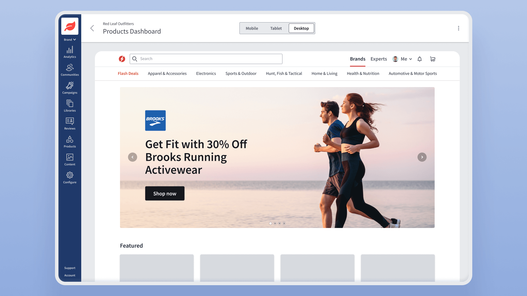
My design philosophy emphasized industry-standard patterns, familiarity, and clarity. I ran A/B tests comparing three variations:
- Promotion-heavy: Multiple campaigns and seasonal promos.
- Product-focused: Highlighting top-selling products.
- Hybrid approach: Balancing promotions and best-sellers.
The hybrid version outperformed others in total clicks, order volume, and gross merchandise value.
I also pushed back against a proposed auto-scrolling carousel by citing third-party usability studies showing negative impacts on conversions—the idea was dropped.
Three design variations were tested; the hybrid layout proved most effective.
Internal Platform Tools
For the admin experience, I prioritized simplicity and flexibility, relying on established patterns whenever possible.
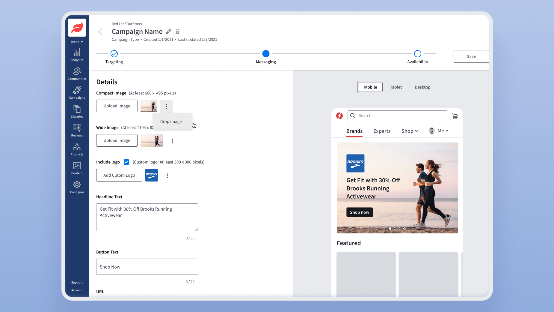
Key improvements included:
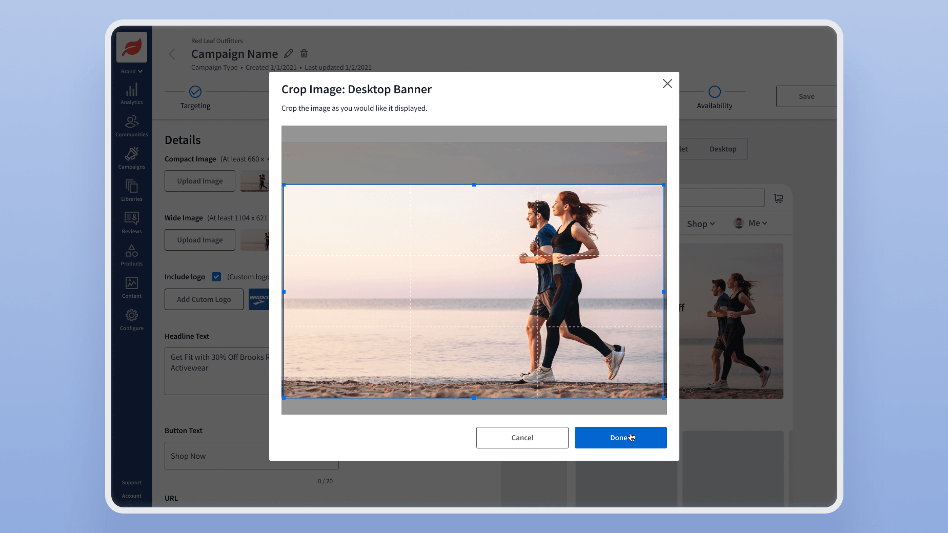
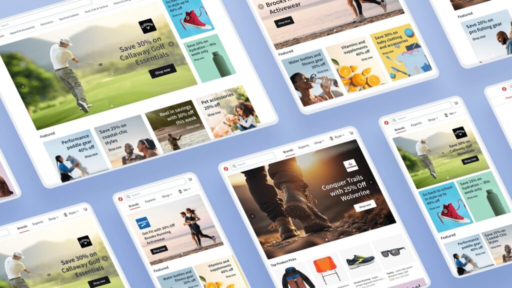
- Previewing assets across screen sizes, reducing QA time.
- Support for SVG graphics, giving designers greater creative freedom and fewer post-launch issues.
- Improved visibility into current and upcoming campaigns, reducing context switching and making scheduling far easier.
Moderated usability testing confirmed that campaign setup was now faster, clearer, and required less training.
The redesigned tools allowed quick previewing across devices and simplified scheduling.
Reflection
I’m especially proud of three outcomes:
- Supporting vector banners (SVGs): This long-requested capability gave internal teams far more flexibility and reduced post-launch issues.
- Simplifying campaign management: Providing clear visibility into campaigns and improving previews addressed one of marketing’s biggest frustrations.
- Establishing a foundation for future merchandising opportunities beyond the hero banner.
If I had more time, I would explore personalization strategies for the hero space and build analytics dashboards directly into the admin tools to give marketing teams real-time feedback on campaign performance.