
From chaotic files to a cohesive, scalable system — a five-year transformation
The Challenge
In 2020, ExpertVoice’s product design process was fragmented and inefficient. Designers used a mix of Sketch and Adobe XD, with prototypes living in InVision or Axure. Final specs were handed off as PDFs in Jira tickets, and all artifacts were buried in a sprawling, unsearchable Dropbox. There was no source of truth. Designs were often out of sync with what was in production, and recreating existing screens was a regular — and frustrating — chore.
As one of four product designers, I experienced this firsthand. Collaboration was difficult, consistency was impossible, and design decisions were constantly being reinvented.
Starting the System
I took the lead in driving change. The first step was identifying a modern design tool that could centralize our work and streamline our collaboration. I championed the move to Figma, introducing it to the team, running trainings, and creating basic how-to guides.
From there, I began to formalize the foundation of what would become the ExpertVoice Design System — starting with brand colors, typography, and shared styles. But the larger goal was clear:
- Improve UI consistency
- Speed up collaboration across teams
- Build a scalable foundation aligned with our dev framework
Building from the Ground Up
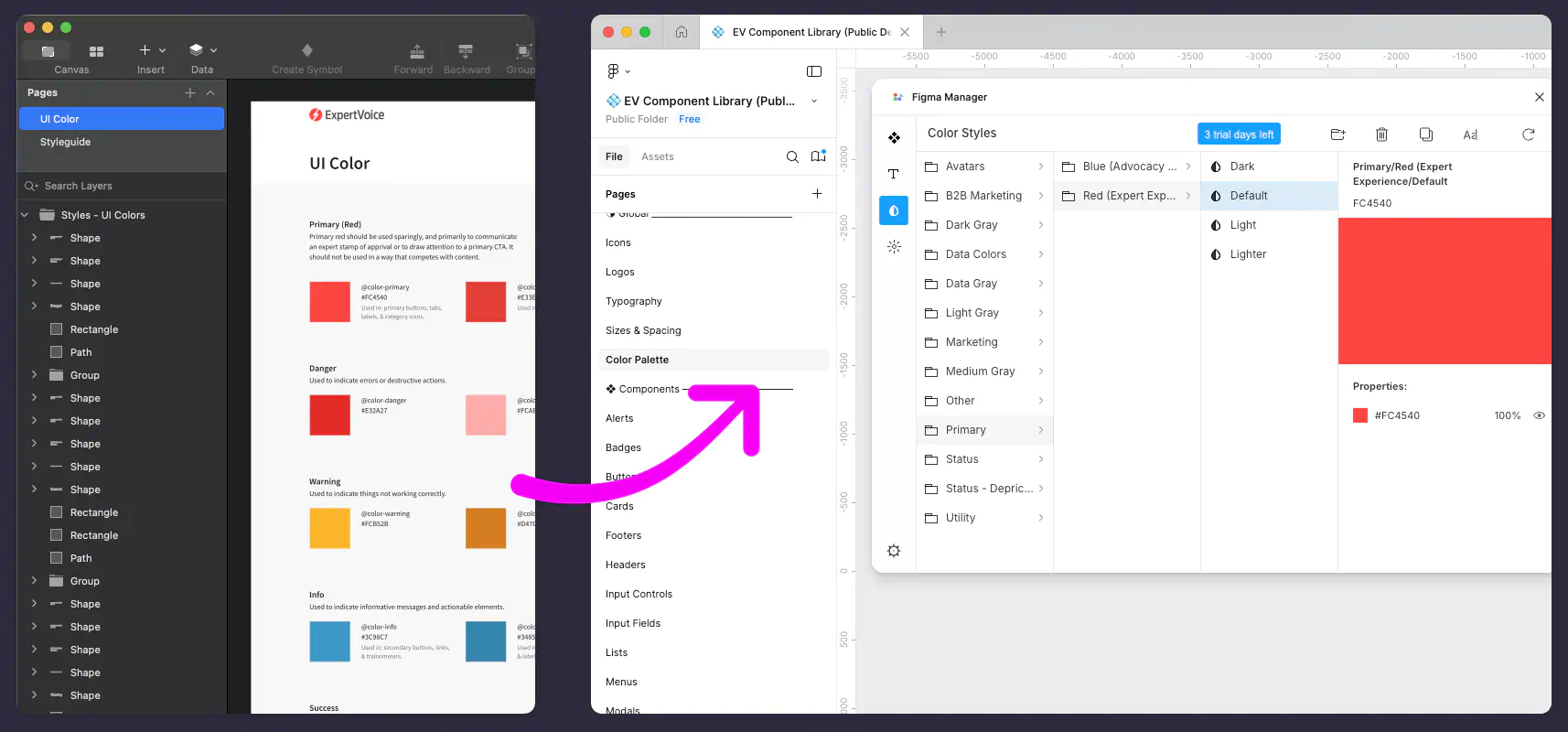
I conducted a comprehensive UI audit to catalog every design element in use across the platform — from buttons to form fields to card layouts. We reviewed components as a team and compared them to accessibility standards (WCAG 2). This process revealed major inconsistencies, including an overwhelming number of undocumented colors in production.
To ensure alignment with engineering, our system was grounded in the development team’s existing custom React framework. For inspiration, I studied best-in-class systems like Material, Carbon, and Atlassian.
Scaling the System
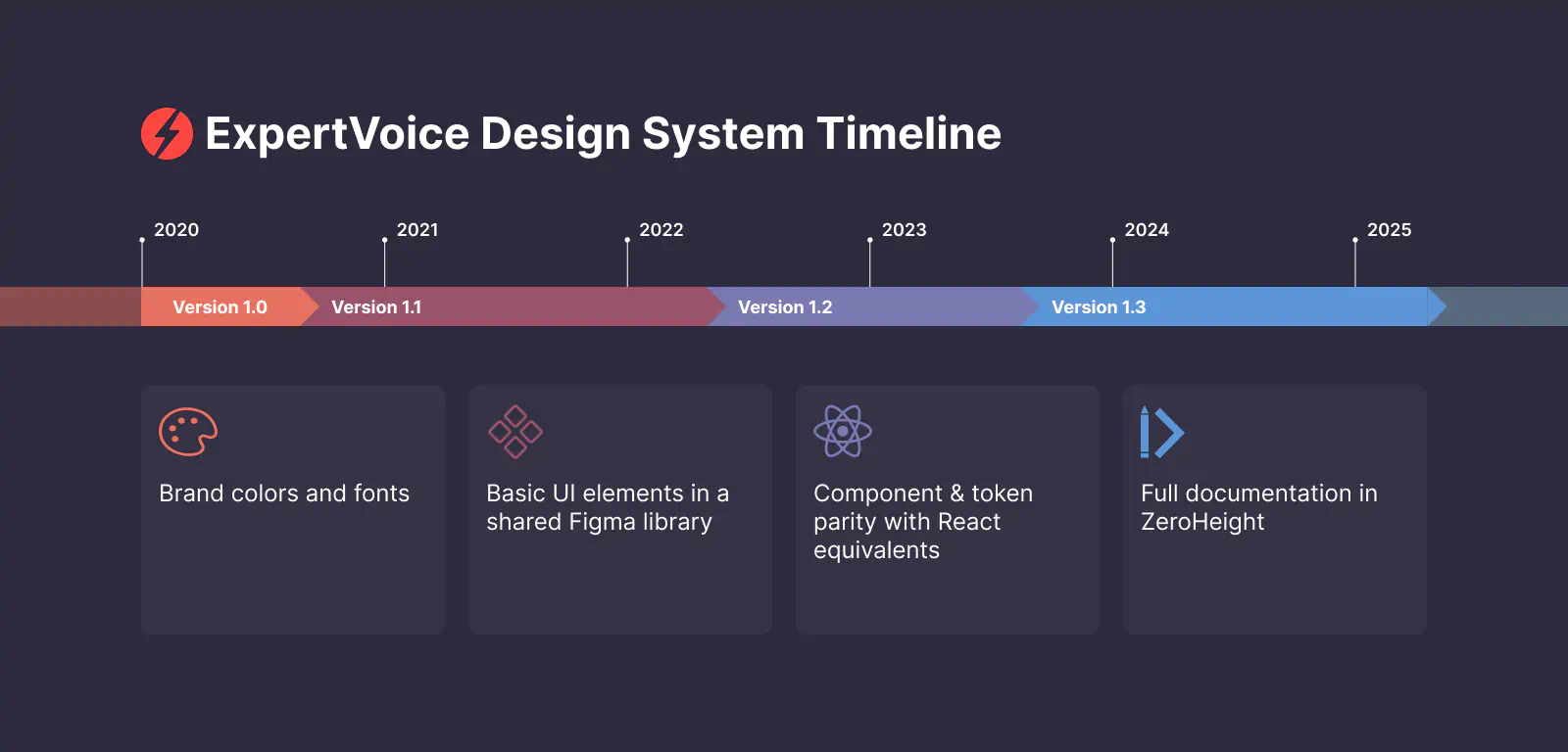
The design system evolved through multiple iterations:
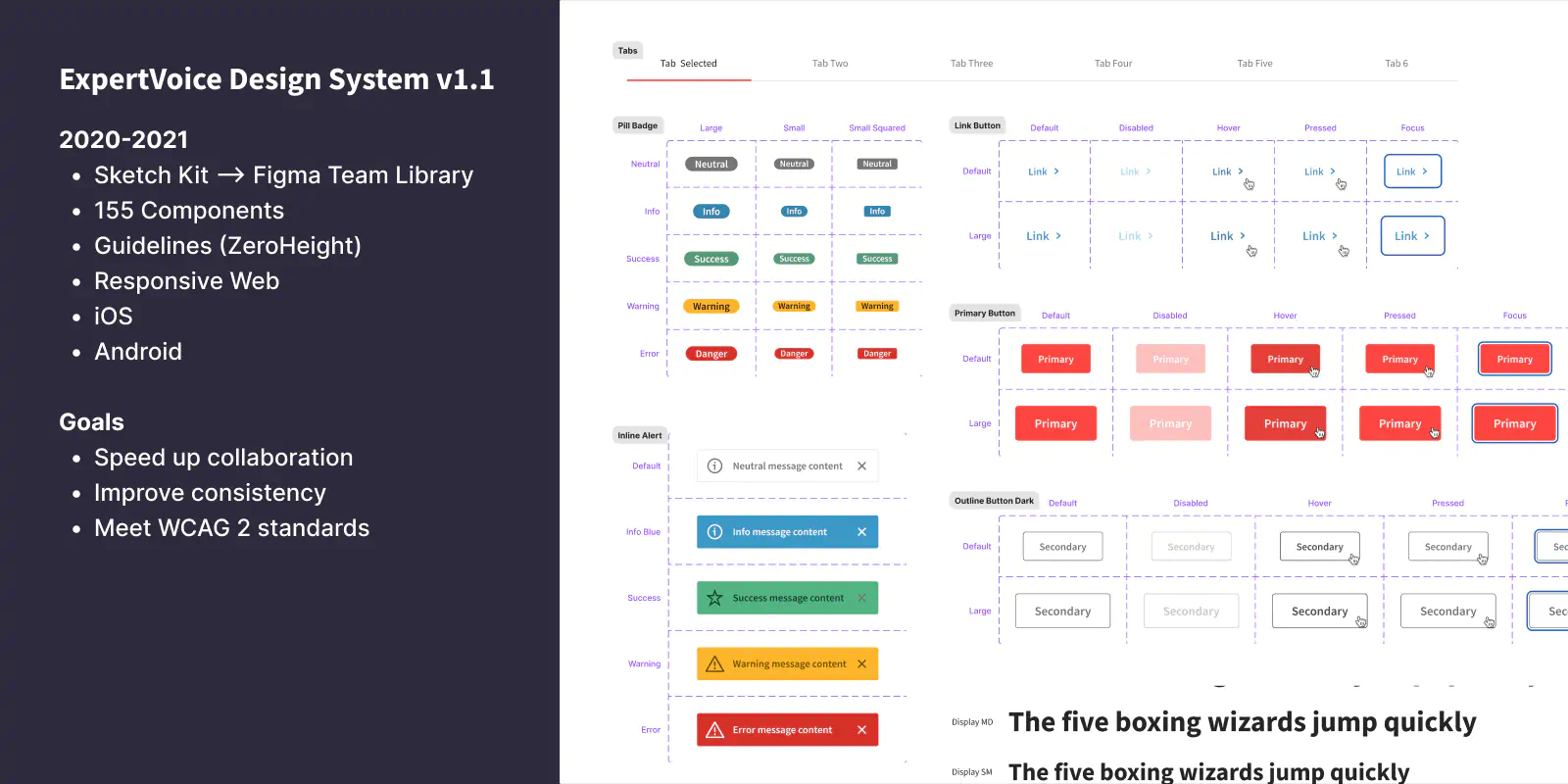
- v1.0 – Brand colors and fonts
- v1.1 – Basic UI elements in a shared Figma library
- v1.2 – Component & token parity with React equivalents
- v1.3 – Full documentation in ZeroHeight
We prioritized shared patterns used across the platform and iteratively layered in complexity — always with usability and developer alignment in mind.
To foster adoption, I demoed new updates in weekly design meetings and announced changes in Slack. Lead designers and engineers held regular system syncs to discuss changes and surface pain points.
Impact
The system quickly became a force multiplier:
- Improved consistency across all product surfaces
- Faster hand-offs thanks to layout utilities and reusable spacing components
- Reduced redundant work, since designers stopped reinventing patterns already in use
- Better accessibility by standardizing contrast-compliant colors
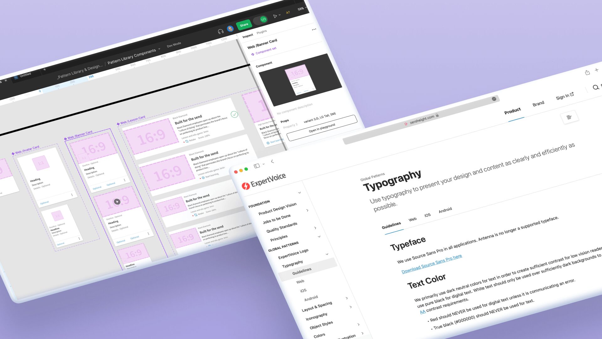
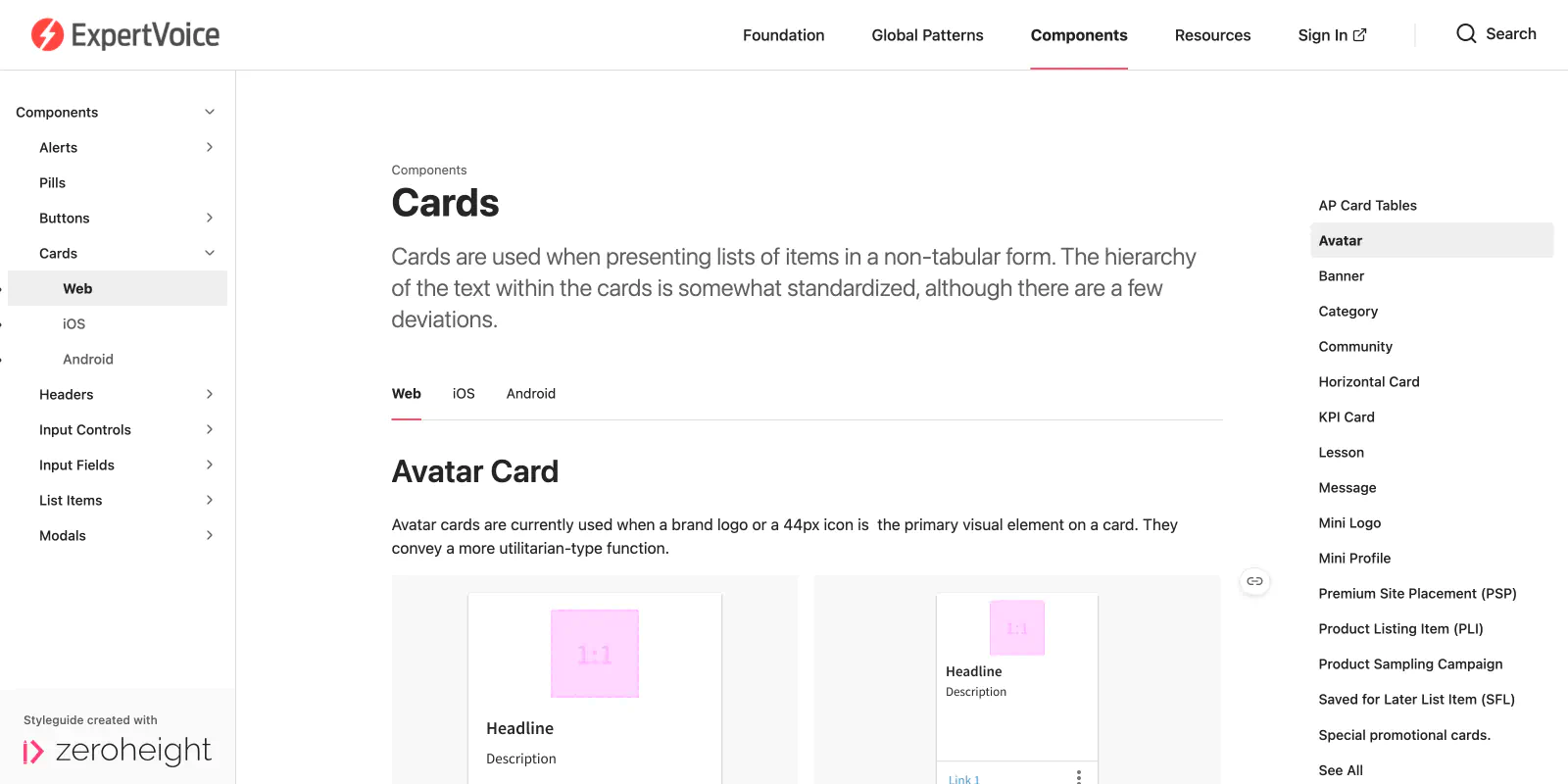
One of my proudest contributions was spearheading our ZeroHeight documentation, which allowed engineers, PMs, and other non-designers to quickly access usage guidance without digging through Figma.
Lessons & Reflection
Creating a design system isn’t a one-time project — it’s an evolving product. One of our biggest challenges was reconciling the many unauthorized colors already in production. Working closely with engineers, I mapped those to approved alternatives and identified style gaps we needed to address in the library.
Looking back, I’d invest even more in aligning the system’s lifecycle with dev implementation. Changes were sometimes deployed only as part of larger feature launches, which created inconsistency across the platform. If I were starting again, I’d formalize the workflow from Figma to code much earlier — prioritizing tighter collaboration between design and front-end from day one.
Today
The ExpertVoice Design System is still active and maintained by the current Product Design team. It’s become a critical part of how new features are designed and built, and it continues to evolve with the product.